Truto
Web designer · Truto
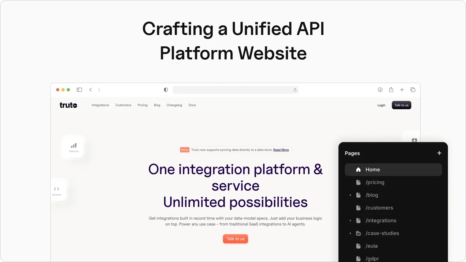
Crafting Truto.com: the website for a unified API platform, translating a dense, developer-facing integrations product into a site that reads clearly and builds trust fast.
Truto is a unified API platform, one integration layer in front of many third-party APIs. The challenge for the site was the usual one for infrastructure products: the value is real but abstract, and developers decide fast. I designed the marketing site to make the platform legible at a glance, what it does, who it's for, and why it's trustworthy, with a structure and component system that the team can extend as the product grows. The brief was a full revamp: a new design, detailed pages for 500+ integrations, and blogs and case studies that teach the product.
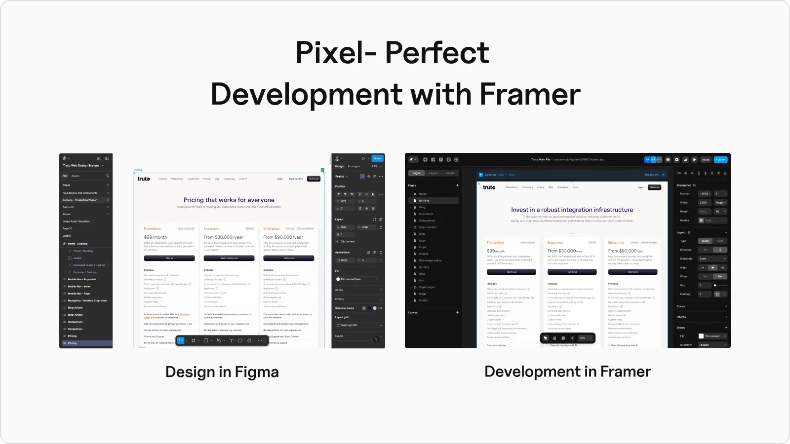
Why Framer. I built the site in Framer because it lets a design land pixel-for-pixel, has a CMS strong enough for large lists, and supports code components for the interactions that aren't available out of the box. The Figma-to-Framer path meant the design carried over without drift, and the CMS could handle the 500+ integrations without buckling. Picking the platform that matched the hardest constraint, scale of content plus fidelity of design, is what kept the rest of the build straightforward.
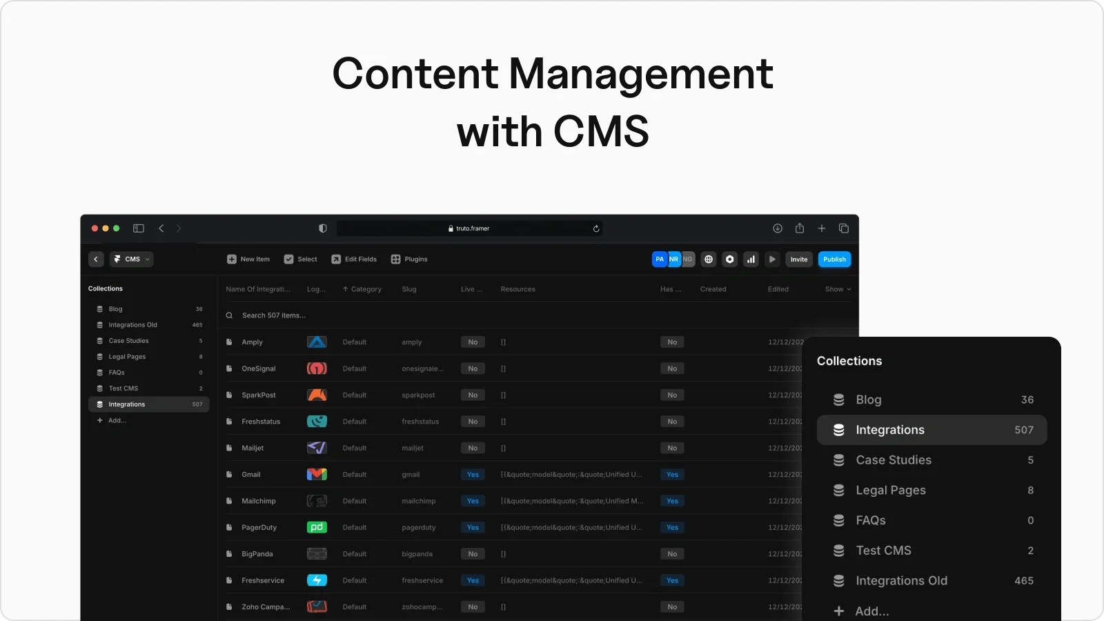
A CMS for 500+ integrations. The content is the product here, so the CMS had to carry it. I structured collections for integrations (an index plus a generated detail page for each of the 500+), blogs (index and article pages), case studies (index and detail), and the static legal pages. Dynamic content across all of these runs on CMS data bound into Framer components through page variables, so one template serves hundreds of pages and the team adds an integration by adding a row, not a page.
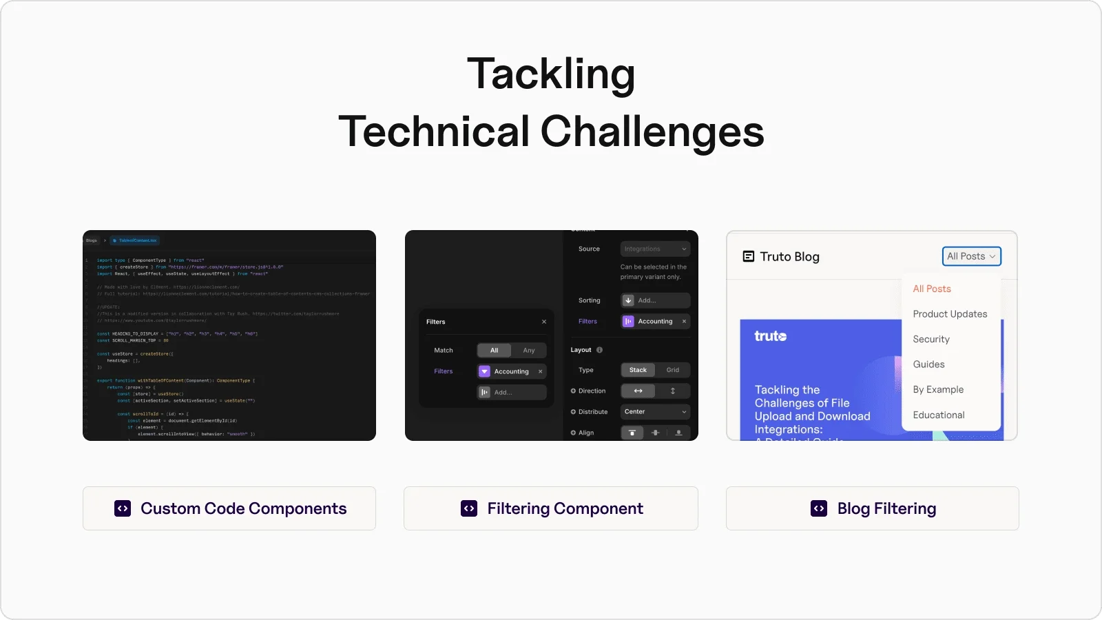
Solving the hard parts in code. A few things the platform doesn't do by default, I built as custom code components: a filtering component so users can sort integrations by category, a filter for navigating blog content, a back button on blog detail pages, and a table of contents for long-form articles. These are the pieces that make a large content site feel navigable instead of overwhelming, and they're where Framer's code escape hatch earned its place.
Built to perform. A 500-page site is only as good as it loads. I compressed images, built reusable components so the same well-optimized block renders everywhere, tagged sections properly and wrote descriptive alt text for accessibility, added custom scripts to lazy-load off-screen images, and backlinked related content into a strong internal network. Performance and SEO weren't a pass at the end; they were built into how the components and content were structured.
Interactive by design. The engaging moments are deliberate: a searchable integrations index so anyone can find a specific connector fast, a slider on the pricing page for moving between tiers, and a dropdown that filters blog posts by category. Small, but they're what turn a brochure into something you navigate, in line with Truto's user-centric bar.
The outcome. The project shipped quickly and the founders were happy, calling out the intuitive design and the comprehensive revamp. The throughline was problem-solving inside Framer: most things a team envisions can be built with a bit of creativity, and Truto.one is the proof, a dense API platform turned into a site that reads clearly and scales with the product.